I'm Not a Designer, But I Shipped a Design System
AI can write code that would have taken me a week in an afternoon. It can refactor, debug, explain, architect. But ask it to design a beautiful UI on its own and you get gradients, floating cards, weird animations, and a layout that screams “made by a language model.”
That’s not AI’s fault. It’s mine.
The real problem isn’t the AI
Every AI tool today is, at its core, a language model. Very smart, trained on a huge chunk of the internet — including probably every good UI that’s ever existed. The knowledge is in there. The taste is in there.
The problem is that I don’t know how to pull it out.
When you’re a software engineer who doesn’t understand UI, you can’t guide the AI toward the good stuff. You can’t say “this spacing is wrong because of X” or “this hierarchy fails because of Y.” So the AI falls back on the statistical average of its training data: gradient buttons, identical cards, weird animations, decorative clutter.
I could feel something was off. I just couldn’t name it. And when you don’t know what’s wrong, you definitely don’t know what’s right. So you end up doing what everyone calls vibe coding — except for design. You push pixels around until it feels okay, and then you ship it.
For backend and frontend code, I’m fine. I’m an engineer, I can read what the AI gives me, push back, redirect. For design? I was flying blind.
The decision
A few weeks ago I decided to redesign one of my side projects as a v2. The functionality was already there — I’d built v1 entirely with vibe coding, just turning ideas into prompts and shipping. Fun, fast, but the visual language was a mess.
And here’s the thing: users don’t need to be designers to know something looks off. “Pretty” has universal standards. The most unsophisticated user will still bounce if your product feels cheap. Competition is brutal now — people have infinite alternatives, and the second your UX annoys them, they’re gone.
So this time I decided: no code until the design is figured out.
Doing it like a real designer (ish)
I looked at a lot of products. Not with engineer eyes — with visual eyes. I tried to find a design language that actually matched what my project was about. Shortlisted two directions, asked people I trust, picked one.
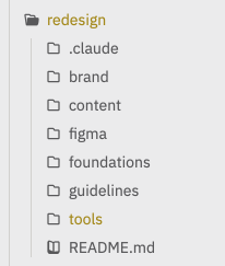
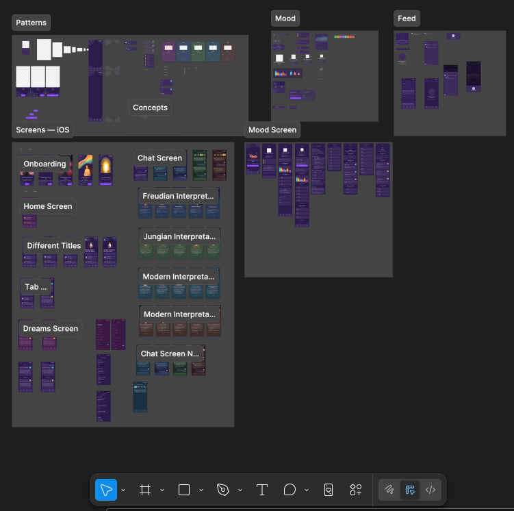
Then I opened Claude, showed it screenshots of references, pointed it at my source code, and we talked through what v2 actually needed. Out of that came a redesign/ folder that became the single source of truth for the whole thing.
First thing I wrote was a design language document — what this design is, what it’s trying to say, how it’s different from v1, and why. Before a single pixel was placed.
Then I went layered:
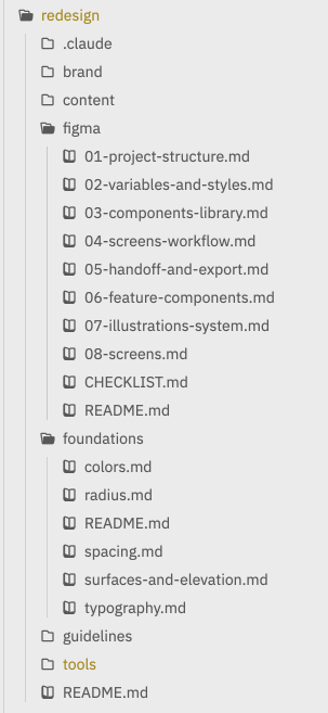
Foundations → Components → Features → Screens
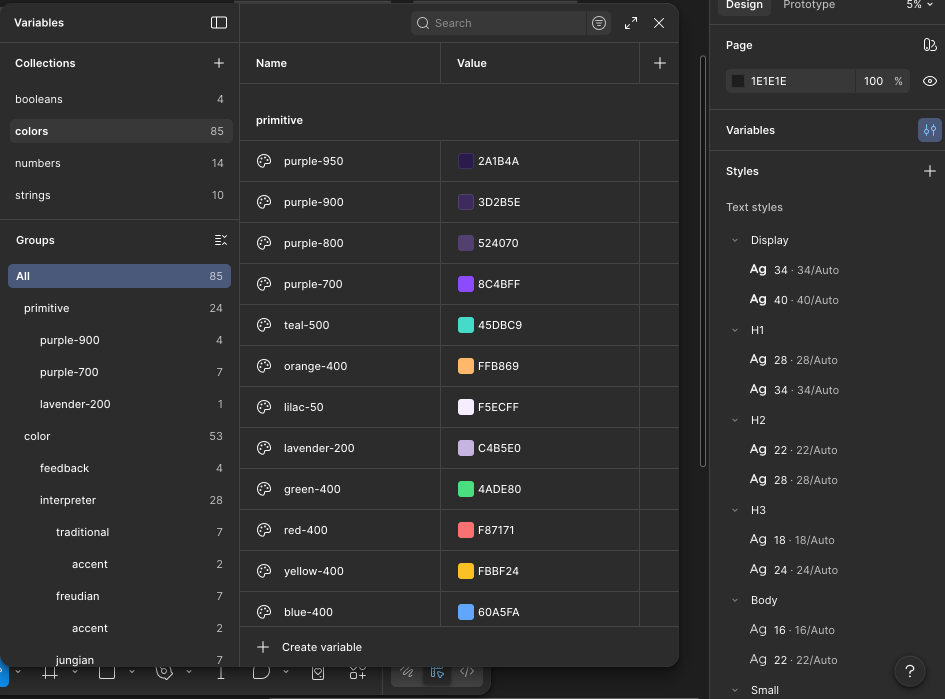
Foundations first: color palette, spacing scale, font sizes, radii, effects. The boring stuff that decides whether everything else looks coherent or chaotic. I didn’t let myself skip this even though I wanted to.
Every token lives in Figma as a variable, referenced everywhere. No magic numbers, no one-off hex codes.
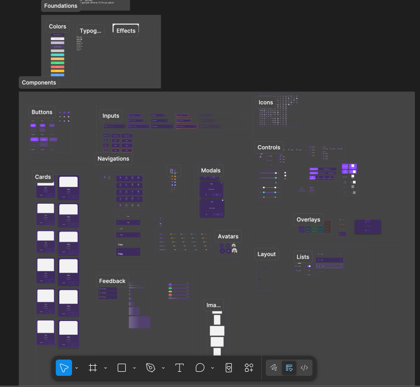
Then components — 38 of them. Buttons, inputs, icons, dividers, the whole atomic set. Every variant, every state, every size. All referencing the tokens I’d just defined.
Here’s a tiny slice of what one component spec looked like:
### Button component set

| Size | Min Height | Padding (h/v) | Text Style |
|------|------------|---------------|------------|
| sm   | 42px       | space/12 / 8  | Small/14   |
| md   | 48px       | space/16 / 12 | Body/16    |
| lg   | 56px       | space/24 / 16 | Body/16    |

type=primary
- default: color/accent/primary, text color/text/primary
- pressed: color/accent/primary/overlay-70
- disabled: + opacity/disabled on whole component
Boring? Yes. Worth it? Also yes. Once the tokens and components exist, everything above them gets easier because the hard decisions are already made.
Then features (combinations of components that do one thing), then screens (combinations of features). Top-down planning, bottom-up building.
Figma by hand, then Figma with Claude
This was before the Figma MCP existed for Claude Code, so I built the whole component library in Figma manually. Tokens, variants, auto-layout, the whole thing. It was slow. It was also the best thing that happened to me in this project, because I finally started learning Figma instead of just poking at it.
Then halfway through the screens, Figma MCP for Claude Code dropped. I subscribed the same day.
Everything accelerated. Not because Claude suddenly became a designer — it didn’t — but because by that point I knew what I wanted, I had tokens and components to reference, and I could have Claude do the mechanical Figma work while I made the judgment calls. The combination of “me, finally knowing Figma” + “Claude, doing the tedious parts” was a different level.
Now I’m going the other direction — turning those Figma screens back into code with the same MCP, with full intent behind every step.
What I actually learned
The design problem isn’t solved by AI. But it’s not unsolvable by me, either. I’m not a designer and this v2 is probably not a great design by a real designer’s standards. There are problems I can’t even see yet. But it’s dramatically better than v1, and I know why it’s better, which means next time will be better again.
Plan the design before you touch code. Style, colors, intent, visual language — all of it needs to exist before the first component. I used to think design would emerge from the code. It doesn’t. Design constrains code, not the other way around.
Layers matter. Foundations → components → features → screens isn’t just how designers talk. It’s how you stop yourself from making 400 inconsistent decisions. Make 20 decisions once, reuse them everywhere.
AI has all the good UI patterns in its training data. You just have to know enough to ask for them specifically. “Make this cleaner” gets you garbage. “Reduce this to 4px spacing, remove the secondary background, use the same radius as the button” gets you results. The more vocabulary you have, the more AI can give you.
Vibe coding is fine for code. Vibe designing is not. Code has tests, types, linters, behavior you can verify. Design has taste, and taste needs structure to stand on.
Where this leaves me
I’m not going to pretend I figured out design in one project. People online are doing incredible work that makes mine look like a first draft — because it probably is one. But I started this knowing nothing and I ended it with a real design system, a real Figma library, and a real process I can reuse on every future project.
If you’re an engineer who ships ideas but stalls on design, this is the part I wish someone had told me earlier: you don’t need to become a designer. You need a process that forces you to make design decisions before you code, and a set of documents that keep you honest about the decisions you already made. The AI is strong enough to do the rest — if you meet it halfway.
That’s the trade I made, and it’s the one I’d make again.